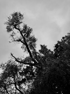
This week I decided to do a project based around nature and wildlife around my house. I made a mix of black and white and color to see what looks best and works best for this project. I want to focus on texture and color and look.
Artist Statement Our goal for this project was to create an illusion of depth, we did this through the use of Leading Lines, Repetition, and Depth Staging. Leading lines are lines that travel from the foreground of the picture into the background, usually they are the main focus of in the picture. Repetition is when you take picture of an object that repeats throughout the picture and into the background creating the illusion of depth in the picture. Depth staging is when you have one object in the foreground and one behind it, sometimes one of the objects will be blurred to add an emphasis to the other object. Depth staging can be created by placing a person or an object in front of something and by focusing on one. Leading Lines Repetition Depth Staging
Symmetry For this project we were assigned the goal of finding and taking pictures that represent symmetry, balance, and asymmetry. Symmetry in a picture basically means that one side of the picture will be the exact same as the other. It is essentially a mirror of the other side, this can be achieved though editing or by simply finding something that is symmetrical. Balance is when in a picture there can be two object that look similar, but their weighting in the picture is different from each other creating a differential in balance. Asymmetry is when there is an object that has two side thats are different from each other, or not symmetrical. Symmetry Asymmetry Balance
Cityscapes + Portraits For this project I was tasked with the job of mimicking the photographic style of professional photographer Jasper James. His work combines Cityscape photography with portraits, he does this through edited them and combining the two in Photoshop. Jasper James's work has a very clear line between what is in focus and what is blurred, and I am still working on blurring the images similar to how he does it. I have begun to understand Photoshop a little bit better in the past two weeks which has allowed me to edit these faster and make them look better. I still need to create a few more picture, most likely with different portraits and different cityscapes.





Comments
Post a Comment