Depth
Artist Statement
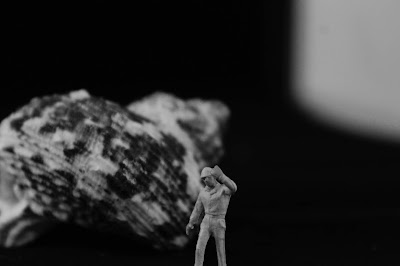
Our goal for this project was to create an illusion of depth, we did this through the use of Leading Lines, Repetition, and Depth Staging. Leading lines are lines that travel from the foreground of the picture into the background, usually they are the main focus of in the picture. Repetition is when you take picture of an object that repeats throughout the picture and into the background creating the illusion of depth in the picture. Depth staging is when you have one object in the foreground and one behind it, sometimes one of the objects will be blurred to add an emphasis to the other object. Depth staging can be created by placing a person or an object in front of something and by focusing on one.
Leading Lines
Repetition
Depth Staging


The usage of black and white filters really makes many of these photos feel like they have a lot of depth, as the lines look very clear. The angles on the repetition photos are also very well done. I like how it isn't immediately clear what the photo is of, but the depth is still very clear.
ReplyDeletethe mix of saturation in this series is well done. i like how the building photos are black and white- showing clearly the lines and textures of the exterior, whereas the color plays a big role in that fourth to last photo, where the sliver of light gives the leaves some color. this was good editing
ReplyDeleteI like how you kept many of the photos in black in white as it gives them good depth with the increase in texture and shadows. I like how some photos are more abstract than others and how in the subject is clear but the way in which we looked at it was not when looking at them.
ReplyDeleteI like that you were able to use all three strategies at many different scales.
ReplyDeleteI like your choice of black and white in some photos as well as your use of people
ReplyDeleteI really like how you used organic photos meaning that they are found naturally and not purposefully set up. Overall great job!
ReplyDeleteThese photos are great Jack. I think the strongest photos you displayed in this series are the ones that are edited in black and white. I think if you keep your images black and white or in color it will create a more unified set of images. Wonderful work!
ReplyDeleteI really enjoyed your photo of the darkness around the entire frame, and then there is that little bit of red that pops out and is almost a tiny line of sight like a crack in the frame. Good job
ReplyDelete