Composition
Composition
By Jack
Artist Statement
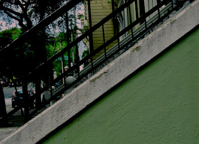
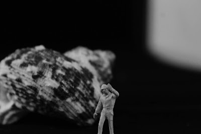
In this project we focused on the composition of our photos, we used three main ideas, the rule of thirds, diagonals, and triangles. The rule of thirds required to divide our pictures into thirds, and in one third of the frame would be the 'main' part of the picture and the other two thirds would be 'blank' compared to the other part. For diagonals we would arrange the composition of the picture to create a diagonal that cuts across the frame, sometimes creating two different sides to the picture. The last way we would compose our pictures would create a triangle in the frame, sometimes it would be the corner of two walls that created a triangle, other times it would be a triangle that was already there as part of a building.
Diagonals
Rule of Thirds
Triangle


I really like the simplicity in some of the photos. You made something bland and simple into something vibrant and attractive to the eye. I especially like the lighting in some of the diagonal shots as you were able to add a whole new level to the original image.
ReplyDeleteGood work on this composition Jack. Your triangle pieces were very strong and it was a good choice to place the triangle figures in front of a plain surface. I like how you put some in black and white and some in color, but usually try to keep them either one or the other. Nice work.
ReplyDeleteThis series was a fantastic start because along with well executing the concepts, you were able to incorporate an interesting set of colors or textures into every shot. I like the distinct lines visible on the leaf, brick roofs, and even the tiny bumps in the concrete.
ReplyDeleteI really like the the triangles in this series. They are very interesting to look at and my favorite is the first triangle photograph. I like how you made the background blurry, so that the triangle would stand out.
ReplyDeleteHi Jack! Awesome work with this photo set– You show great understanding of compsition while producing clear, simple, yet interesting photos. Interesting use of positive and negative space and I like the photos of the of the tops of the buildings the most.
ReplyDeleteI really liked how you played around with lights and darks. I like how you're able to see shadows but still have color present in the photo.
ReplyDeleteI really liked how each photo is so different from one another but at the same time they are all part of a set with similarities. I especially like the triangular photo with the soft background and the sharp defined triangle in front.
ReplyDeleteI liked how you took very simple photos and gave them a new aspect of detail with the colour and editing.
ReplyDeleteThe photos here are usually very close up to the object, without much of a background which makes the shapes being captured really stand out well. I also like the contrast between grey and colors shown in many of these photos.
ReplyDelete